Hello friends…
Welcome to Week 2 of Project Design Gallery Wall.
Today I’m showing you my dining room because that’s where my gallery wall is going.
This is what it looks like these days.
And this is what it looked like a few months ago when the old owners lived here.
You can probably tell the obvious challenge in here is the lack of natural light.
With only one window, it might seem counter intuitive to paint a room like this BM’s Kendall Charcoal, but I have to tell you I’m loving it; it’s a clean, deep shade, and it makes the room feel cozy instead of just small.
I just painted the chandelier too.
So the basics are done and I’m ready to get to work on this wall:
From the living room, the gallery wall is on the right side.
And this is the opposite side. I chose to put my mirror on this side of the room because it reflects the most natural light here and when it comes to light, every little bit helps in this house.
For my gallery wall I decided to do something totally different for me.
Usually I’m a “salon style” kinda gal. Not too much pre-planning, I just keep moving my artwork around until I like it. I also like the eclectic look of mixing frames and using both vintage and modern art. But for this project I thought it’d be fun to get out of my comfort zone and to measure and plan a wall out.
And use a single art theme.
I found the perfect images too; I’m using an old book of flower prints I found in an antique store and I’ve been saving them. Do you do that too? Buy something and then wait for the right project?
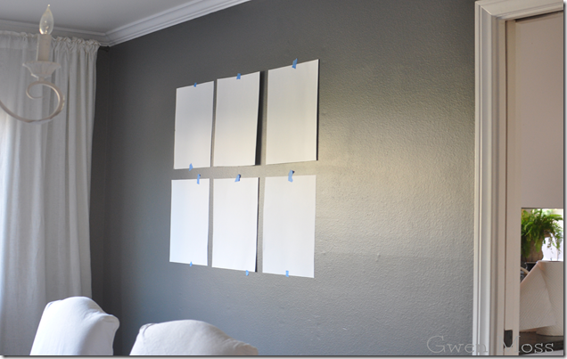
Anyway, I’m putting the prints in six white frames with cream mats from Ikea and I’ll be arranging them in a grid. Three on top and three on bottom in the center of this wall.
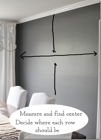
Here’s what I did to map out my gallery wall.
And here it is, the mapped out version. Hoorayyyy…easy-peasy-all-done-right?
Wrong.
I decided I didn’t like the two rows of three after all. When you’re standing in the room it lacks enough weight on the wall. So two more poster board pieces, scissors, and cut-cut… and I’m sooooo much happier.
And honestly, I eyeballed this version.
(I know, I’m hopeless but I promise to use my level when I hang the real ones).
Ok. So now there’s only one more decision. The color of the actual artwork.
But first, here’s a few details of the room.
layered rugs…
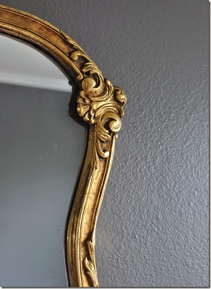
a vintage mirror
this cute bar cart to be styled for under my gallery wall
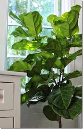
and this fiddle leaf fig tree to balance the other side of the room.
I always planned on using the colored flower prints because I guess I’m a color person by nature. I just don’t seem to have the restraint necessary for a whole black and white gallery wall.
But honestly, I was surprised how pretty the black and white flower prints look en mass against the charcoal wall color.
Ok. Here’s a picture of the prints when they’re not inside the mat.
I think I know what I’m doing. But I’d love to hear your thoughts.
A charcoal colored gallery wall using the color prints
or the neutral ones?
In the meantime don’t forget to stop by and check out these incredibly talented bloggers. It’s soooo fun to see what everyone else has planned.
I love me some good old “Before” pictures, don’t you?
Here’s the other participants in the gallery wall project:
And just a reminder, next Monday is the big reveal!
xoxo
Leslie


27 comments:
I love your room and the color is so gorgeous - can't wait to see your images hanging!!
This looks so great Leslie....I did think of you when I painted my chest of drawers the other week & completely transformed it!! I thought of your wonderful ability to see the potential in something.
Love the grey you have chosen....and those white frames always look so good.
Can't wait to see the finished result :)
Beautiful!! The room AND the art, no matter which way you go. I totally get the color thing, and I love them, but the neutral is amazing, too. Tough choice, both are great. But I think I'd go color. No, neutral. No, color...
HI Leslie- love the color of the wall... What color is it? I have like 5 swatches going on in my bathroom and I'm losing my mind! laura
Oh just re-read the post. I have Kendall Charcoal sample!!! laura
neutral all the way...
donna
I love your pictures...its going to look so pretty!
I love the sophistication of the room! The wall color is amazing and I love simple white drapes. I picked up a cool old book of botanical prints and I've been thinking about framing them too. I love the pops of color in your prints, but if you're really trying to step outside your comfort zone, go with the black and white. Either way, it will be awesome! Can't wait to check out the accessories to the bar cart too!
This room is beautiful, Leslie and the gallery wall will be wonderful jewelry! Can't wait to see the reveal!
I love all of the elements you already have in this room and it's so funny that you had the same thoughts that I did when choosing prints for your dark walls. I was going to go with color too but was amazed by how gorgeous black and whites looked against the dark wall - you can't go wrong either way! Can't wait to see it!
Hmmm we are birds of a feather. I do not normally plan either in my own home. I am more of a wing it type of person. I leave the measuring up to my precise husband. I love the idea of using the black and white....I stewed about using color as well and decided against it!! Your room is looking lovely!!
I'm doing my dining room, too. And I have a similar mirror and tree! I LOVE where you are going with this. Great wall color, too. Now you have me wanting to look for antique books for prints. Where did you find yours?
I am loving the color on the walls and the chairs. The prints are beautiful and will make a great gallery wall.
Thanks for the list of blogs. I don't think I am familiar with any of them so I have some "looking" to do today.
leslie i love your charcoal walls and with the white so bright and cozy, not an easy task.
great tutorial too, i always just wing it.......
vote; black & white
see you next week!
debra
To be honest, I'm not a fan of all neutrals. Often, it all seems to wash or blur together.
For example; the photo you posted of the 4 over 4 configuration. The only thing that caught my eye in the picture was the lovely blue/white vase with the coral flowers in the adjoining room! That's what attracted and interested me!!
Needless to say, I vote for the colorful botanicals. :-)
Marilyn (in Dallas)
Color prints for sure! It will add so much more warmth to the room, along with the gold mirror. You will be able to play more with colors in the room, like vases, dishes, etc....
I say frame up both coloured and b/w flowers and hang what will work best for how you want the space to look and feel. I have pictures (cheap ones mind you) that I rotate with the seasons. Both will look and feel great : ). Patty/NS
Well....I am a neutral girl at heart....so I am loving the black and white prints....but dang the colored ones look great also! I'm on the fence. Also....Kendall Charcoal is one of my favs.
I'm thinking the color would add to the room, but I'm also a very indecisive person! I'd have to see them both up on the wall to get the overall effect.
I just cannot tell you how much I love the charcoal paint! I was going to suggest placing more prints and I guess
GMTA's really work. :) I like the color prints best...I think there are so many neutrals in the room that they would be gorgeous.
Great job!
xo
Pat
Leslie,
I'm in favor of the neutral prints. But either set will look great on that wall. I'm with you, the 4 over 4 looks so much better.
It will be so much fun visiting everyone with the final gallery.
Karen
That room is very beautiful and cozy! When I saw the prints in the black and white, I loved it! But then I thought about why...it was the continuity of color. When I used botanicals years ago in a foyer, I used ones that had blooms of the same color in each. In one arrangement, I used prints of plants all with red blooms. In another arrangement I used all yellows. I love color too much! (And yes this is the girl with a million black and white photos in her house...go figure!)
Hi,
I like the color prints best.
I love how all of it is coming together for you. Great work and I know hard work too.
♥
Carla
I can't believe how much the paint color has changed your dining room, Leslie! You know I'd hang the colored prints, but I actually like the idea of black & white prints against your charcoal walls. I know you'll add your seasonal pops of color and they'll be all the more dramatic in a neutral room. I can't wait to see what you decide! I love the soft white curtains you've hung!
Vickie
Leslie, I love the black and white! Although I think the color would be fabulous with your beautiful gray color!
I love the wall color, the gold mirror looks so beautiful on gray. Can't wait to see if you go with the color prints or black and white!
I love all gallery walls. To me, when it comes to art, more is more. My dining room is black so you know I love your grey walls. I agree that it makes the room lovely, not small. The matching white frames are going to be perfect, with either the neutral or the colors. You could just switch them out for seasons. Colored for spring and summer. Neutral for fall and winter. In my dining room the gallery wall is black and white with two colored pieces interjected. You could do all black and white with one colored picture. I'm thinking that would be really fun.
Post a Comment