Pages

Thursday, October 26, 2017

How I made this French vintage-looking sign


Hello friends.


A few of you asked me about the vintage-looking sign I made for my recent guest post and since I took a few pictures along the way I thought I'd do a quick post on it.

I realize the blog world is full of great tutorials on home-made signs but maybe there's something I did that might be helpful to you.

If you follow me on Instagram you probably saw this picture of my front door already.


This was the first sign I've ever made but I began this project with a clear idea of what I wanted my sign to look like and where I planned on placing it: over the front door.


I found this piece of dried plywood on the side of our house--in a pile meant for the garbage-- and I pulled it out, wiped off the cobwebs and after I measured the space over the door I realized this piece of wood would be perfect.

I know. It's hard to imagine seeing it "before."


I sanded it lightly, then used my table saw to cut the length. I planned on fitting it between my door trim (ceiling and door) but at the last minute I couldn't find my jigsaw so it ended up being wider than originally planned.

The good news is that I liked it better that way.

For the purposes of my guest post I decided to add a Parisian touch to my door by writing out the words "Welcome Friends" in French. 

Here's my inspiration picture from my IPhone showing the color and font that I wanted to emulate. It's hard to tell in this photo but the background is a soft gray.


Once my wood was the right size the painting was next.


I basically used some leftover white chalk paint as a base and layered white with light and dark gray shades combining these until I got a weathered look.


I bought some wood trim similar to the one in my photo and painted it....


...and cut 45 degree angles with my table saw. 


The ONE problem I had was when I tried to use my nail gun to attach the trim. I'm not sure why, but it ripped the trim piece on my first try and after calling my Dad for help, I decided to use Elmer's wood glue instead of nails.


After it was glued, I taped the trim to hold it firm and since I didn't have clamps, I turned it upside down (Dad you-are-so-smart!) and put stacks of books on top until it could dry.

Next comes the most time-consuming part of the sign. I had bought some large stencils thinking I would simply trace them, but when I laid them out the letters were too large and thick for the look I wanted.


So this is how I got the perfect size letters for this sign.


I cut out each stencil letter that I would be using, then I pulled off the black adhesive part, discarded it, and worked with the white portion only. Using scissors I trimmed each white letter (I wanted a thinner letter like my inspiration photo), then set it down on the wood and traced it. I use 'my eye' to determine the right distance between the letters.


Once the letters were all out-lined, I just painted inside the lines.


Here's a shot of the sign before I sanded it down in parts to age it. 

I actually love how it turned out --in fact-- this sign inspired me to give my dining room a new look for the holidays. 

See this dark wood table? It's actually one of the most expensive pieces of furniture we own. We bought it after we got married and paid a ridiculous amount for it... but guess what?

Today it looks totally different.

I sent my mom a photo of it after I took the sander to it and she texted back,

 "Cool! But only you would sand your beautiful dinner table."

I had to laugh. But I loooove all the gorgeous wood grain that I can see now, and I can't wait to show you.

Stay tuned for my dining room refresh. New rug. Light rustic table. Bye-bye mirror and hello simpler look. Oh, and the sign is going in here too.


Thank  you friends for visiting me, I sure hope you enjoyed my little tutorial.
xo
Leslie

I'm sharing this post here:
Feathered Nest Friday

Thursday, October 19, 2017

Soul Keeping Lessons from a DIY Renovator (Hello Lovely)


Well friends, today is the day!

I've got my welcome mat out, my Dutch door is wide open and my special guest has arrived!!

If you don't already know Michele Ranard from Hello Lovely you are in for such a treat. Besides being an accomplished DIY renovator (two houses in two years) she is a prolific writer and artist who somehow finds time to maintain a gorgeous design blog.

And yet, what makes Michele stand out from the crowd --in my mind--is when she weaves her unique wisdom and serenity into her topics the way she did in this post.  

If you've ever been part of a long-awaited home renovation or a simple, blood-and-sweat DIY project you'll want to read Michele's reflections on her own experience.

Reading Michele's post made me stop and realize how our home projects--with all the sacrifices and stress and delays along with way---can be 'gifts' that help us grow into a better person. 

I hope you enjoy this post as much as I did! 

--Leslie


Peaceful neutral decor with Belgian linen in kitchen by Hello Lovely Studio
My Kitchen - Hello Lovely Studio

What a treat to be a guest of Gwen Moss today!

I'm Michele of Hello Lovely, and like you,
I admire Leslie's design style and
lovely heart which has been inspiring
mine for years now.

Home for me is in Northern Illinois, and
while I have always been a summer girl.
in the second half of life, I have
fallen in love with the unfolding 
beauty of autumn.

Fall brings:
fresh apples from the orchard,
crisps and cobblers bubbling over in the oven,
shopping for vintage at fleamarkets,
and hiking outdoors where the
changing colors delight.

This is the first fall in our home
where we're not swamped with
DIY whole house renovation,
and it's a great time to reflect
on how downsizing and renovating
has deepened us in profound ways.


Let difficulty transform you Pema Chodon quote - Hello Lovely Studio
Hello Lovely Studio

The kitchen needed to be completely
gutted, and the reno process brought
disappointments...for example,
learning we wouldn't be able
to lose a wall to create a more
spacious hub for our family to gather.

The gift that emerged instead?
Cozy intimacy.

 Rubbing shoulders with
people you love is not the worst
compromise one must make.


Modern farmhouse white kitchen with farm sink and Shaker cabinets by Hello Lovely Studio
My Kitchen - Hello Lovely Studio

Belgian style farmhouse decor in living room with white oak by Hello Lovely Studio
My  Living Room - Hello Lovely Studio

I was not a huge fan of the fan windows
we inherited with this fixer upper,
yet when a blog reader called them
"church-like," I changed my tune.

Slight shifts in perception
can pack a huge punch. 

Church-like is perfect for someone
who longs for her place to feel prayerful.

French inspired pea gravel courtyard by Hello Lovely Studio
My Courtyard - Hello Lovely Studio

Weeds and dead shrubbery had overtaken
the front entry area, and the remedy?
Subtraction and creativity.

With a limited budget, we simply erased
all but one plant, and brought
in boxwood and pea gravel for an
airy French-inspired courtyard.

Letting go is also good for the soul.


Exterior of our home on a hill - Hello Lovely Studio
My Home - Hello Lovely Studio

Every act of love is a work of peace - sign by Hello Lovely Studio
My Courtyard - Hello Lovely Studio

Galvanized buckets and pinecones in fall by Hello Lovely Studio
My Courtyard - Hello Lovely Studio


A few more peeks inside...

Vintage chair and white decor by Hello Lovely Studio
My Studio - Hello Lovely Studio

White painted pumpkins and vintage bag by Hello Lovely Studio
My Studio - Hello Lovely Studio

What's inspiring you this fall?


Vintage rusty white bicycle in peagravel and fallen leaves by Hello Lovely Studio
My Courtyard - Hello Lovely Studio

Thanks so much for having me, and
I hope you'll come visit Hello Lovely,
where Leslie is my guest!

Peace to you right where you are.

~Michele


Thank you again Michele... for sharing your beautiful home and your inspiring perspective with us!

--Leslie

I'm sharing this post with friends:
Feathered Nest Friday
Imparting Grace

Sunday, October 15, 2017

How a monster face became a classic garden sculpture: my latest (crazy) DIY project


Image result for house beautiful french farmhouse garden statues

If you clicked on to this post title you are:

A. a gardener with a strange fixation for anything-Halloween
B. a person who often loses control of her wildly creative impulses
C. someone who thought, "what the hell is this post about?"
D. all of the above

Well, whatever your answer I'm glad you're here.

And I promise, you will leave here knowing how I transformed a monster face to go perfectly with my Fall front door.

(Sigh, doesn't that last sentence sound so wonderfully weird  Halloweenish?)

Well friends, it's not every day that I decide to try to make one of those classic, concrete garden statues but
if you read my last post, you know that I'm guest-posting over at Hello Lovely Studio this coming week, and since Michele and her readers love the style of classic European homes, I had to think of a post they would like.

Since my own front door was without a single Fall decoration, and since I really wanted to impress Michele with a warm, welcoming entry, I came up with this idea for a guest post:

 "3 ways to add French charm to your Fall front door."

Sound good?

For my guest post --I'll be showing you my front door with:  


  1. my DIY vintage French sign
  2. my gilded Old World pumpkins
  3. a DIY classic garden statue

Meanwhile, welcome to 'classic garden statue' day.

Here we go...so the big question I always have after I get one of my 'great' ideas is, "Can it be done?"

Which seems sort of important. (dark humor)

Can I really make one of those aged, moss-tinged beauties that I envision when I think of the gardens of old European homes?

Well friends.

Today I'm sharing the results of my DIY garden sculpture ... and yes, it worked.

(minus the "moss-tinged" part)

I actually tested out and confirmed that you can indeed put fast-drying mortar mix on to Styrofoam and get it to stick.
Translation: you can do this too!

But first things first.

To get my confidence going, I had to Google (what did we do before Google?)  until I found someone who did a variation of what I wanted to do and saw the word "mud pies" to describe the consistency of the concrete, and I was off running to Home Depot to buy the product I was already familiar with.


Next I had to find a Styrofoam 'sculpture' that I wanted for my two matching urns, and since it's so close to Halloween I decided to add a fun touch to my front door by using a head. Yes, I imagined a Old World head coming out of my pretty flower-filled urn.

How's that for a perfect little nod to Halloween?

But here's the problem I faced. All the Styrofoam heads that are commonly sold in stores actually tilt to one side. I know. These are actually details I spend time thinking about, but back to my dilemma: a tilting head would not look right as a garden sculpture. 

So I got on Google again, found the perfect male Styrofoam heads, calculated how much money it would cost to expedite shipping, and decided THAT option was dead.

Unfortunately I was back to square one. With the tilted heads.

So I headed back to my original store and walked up and down the aisles looking totally perplexed
(if you're a DIYer you know this look)
and BAM! I had apparently roamed down the Halloween aisle and found myself staring at the most beautiful monster Styrofoam head ever and ...here's the crucial part:


  1. It was NOT tilted.
  2. It was MALE and
  3. It was DIRT-CHEAP! 

I bought this additional Styrofoam block for the head to complete my "classic head form" and used a thin dowel to connect both.

Ahhh... so perfect.


Ok, if you're going to do this make sure you wear gloves. I also kept the mortar-water mixture on the runny side while blending, then I could squeeze out the excess water if needed.

Basically you work in layers. Keep squinting with the water bottle until the consistency blends with the previous layer.

But I'll be honest, at his point I had the worst-sinking feeling when I took this picture. 

I was actually thinking, "OMG... is this going to work?!"


And about now I'm thinking, "Michele's readers are gonna think I am SO nuts!"  

(My readers already know that ha)


But heck, once I got started I was actually curious to see how it would turn out. I got a light coat on the first one before I started slathering the second head with the mortar mix. The second head ended up being slightly more defined. 


I realized that first coat needs to be a really light one --almost transparent--before you add more layers.


I used that water bottle to keep squinting it--it helps it cure a little more slowly although it was cool and damp outside and I wasn't too worried about it cracking. Here it is still wet.


The next morning. Ta daaaa!

Since I finished my heads I have stumbled on some ways to "age" new garden statues so they look even more authentic. If I had time I would try it.


Meanwhile, here's a peek at these garden head statues in my urns. 


And here's a glimpse with my version of 'Old World' pumpkins too.

Don't forget to check back with Hello Lovely Studio to see my entire front door reveal including the vintage French sign, I'm so happy with how it turned out.

thank you so much for your visit, 
xo
Leslie
  
I'm sharing this post with friends:

Show and Share 381
Bouquet of Talent Party
Inspire Me Tuesday
The Scoop 297

Thursday, October 12, 2017

DIY: how to make beautiful Old World pumpkins out of plain orange ones


What do you do when company is coming?

But wait--not just any company, what if it's a beautiful, blonde woman with Parisian connections, who travels in the design world with ease, and who has renovated not just one--but two homes in the last few years? 

Yep, one of those talented, smart, efficient gals who would be intimidating if she wasn't so darn humble and sweet.

But she's still company. And she's coming!

Ok.

Well maybe not exactly in person, but Michele Ranard of Hello Lovely Studio is coming to my blog next week and of course, that means I need to get ready for her. Figure out what she and her sophisticated friends would enjoy from this hostess, because oh-did I tell you? I'll be meeting them too, over at her place. 

If you're already a fan of Michele's you know her love of all things French.... elegant, simple and rustic. When I think of Michele's style it runs the gamut of
French-Farmhouse. European Countryside. Parisian Sophistication. And Scandinavian simplicity.   

And so with this in mind, I've decided to welcome Michele with some subtle European touches at my front door and, since it's so close to Halloween...well I can't resist adding a special Gothic surprise for a little fun.  

But first, let's talk pumpkin transformation for this special visitor!


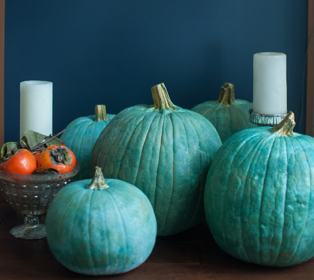
I decided to begin by transforming these basic orange pumpkins into something more elegant and Old World. 


I decided to apply a soft metallic palette using shades of greens and blues.


 I began by adding layers using a large stencil brush I already owned....


I applied metallic gold paint to the stems and added this gold to the pumpkins by dabbing it lightly into the layers.


You can see the color scheme on my paper plate. 
What do you think?
Are you feeling an old European vibe here?


I can't wait to show you the simple details I'm working on that will blend with these pretty pumpkins.

Hint: when you think of European style and the outdoors, don't you automatically think of classic urns and aged concrete garden sculptures?

Well how about a DIYer garden sculpture--am I that crazy?

The answer is YES!


Stay tuned for more French-styling at my front door. 


xo
Leslie

sharing this post here:
Feathered Nest Friday
Related Posts Plugin for WordPress, Blogger...