Hooraaaay! Mission Accomplished.
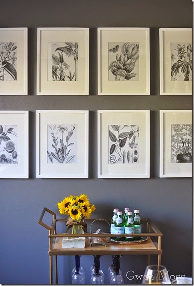
Well. It’s Reveal Day for the Gallery Wall Design Project and as you can see, I chose the black and white vintage flower prints for my wall.
You can check out Week 1 for my gallery inspiration and Week 2 to see some Before shots of this room.
When it comes to art work I always seem to gravitate towards vibrant color so for this gallery wall I decided to get out of my comfort zone.
Most of you voted for this same decision. Although some readers like Marilyn, worried these prints would lack that certain pizazz against the gray wall.
Maybe look a little blah.
And as a color aficionado, I totally knew what she meant.
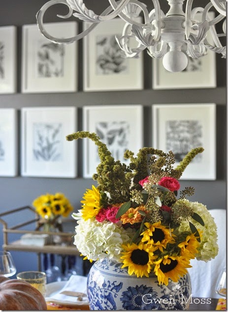
So today I created a Fall tablescape in shades of gold to show you how versatile a neutral background can be.
If you’re a regular visitor to my blog you know how much I love to give you ideas for your own table, so I’ll be sharing details in a later post.
But for now you can see how these white $7.99 Ikea frames really pop out against
the BM Kendall Charcoal walls.
And I have to tell you, I’m really loving my new gallery wall.
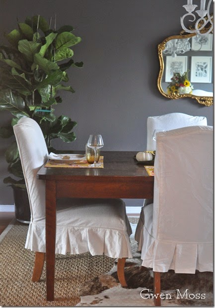
Only it’s tough to get a shot without the glare on the prints today, so let me show you the gallery wall in the mirror.
To keep this room from looking a tad too precious, I layered a cowhide rug over the sea grass and added a bar cart.
You can see how I used thrift store finds to style this bar cart HERE.
After painting this room along with the chandelier, and adding the gallery wall, the final thing-to-do in here is to add simple bamboo shades to the window. I think the honey color and woven texture of the shades will add some warmth to all the white and gray.
Thanks so much for joining me today and for all your great input…
and thank you Mary Ann and Cindy for including me with all these talented ladies. It was so fun and the best part was that it forced me to actually finish a room in our new home!
As some of you know, we’ve recently moved into a smaller home in a beach community and we now live in a fixer-upper-soon to-be-beach-cottage. So if you like to see lots of Before and After pictures you’ll want to come back because I plan on bringing you guys along for the adventure.
And now…drum roll please…. it’s time to find out what everyone else did with their own gallery walls. I can’t wait!
xoxo
Leslie


Beautiful, Leslie! I love the gray prints on the darker wall.
ReplyDeletexx,
Sherry
Leslie,
ReplyDeleteI think your wall gallery is stunning. I love the calm it creates with the gray walls and white frames. It will never be blah as your touches of color on the table and bar cart can be the color icing on the cake! This room is so inviting and wonderful. Great job.
xo,
Karen
Girl....you nailed it. I could not love the black and white prints and frames more. They look so good and of course you are right....that leaves it open for a colorful tablescape! Perfect!
ReplyDeleteLeslie I love your gallery wall...love the whole room!! The woven shades will be the perfect finishing touch! BEAUTIFUL!!
ReplyDeleteThis is so elegant…the gray wall and fresh prints…so true that you can mix up the table settings seasonally. You would never guess the frames came from IKEA. Lovely job.
ReplyDeleteStunning. Really. I just love the whole room. I had to go back and check out the before photo of what the room looked like in another life and it really doesn't even compare. Great job!
ReplyDeleteYour black and white gallery wall is anything but boring - it looks fantastic against those dark walls! And your table setting looks unbelievable - looking forward to seeing more of it!
ReplyDeleteA very sophisticated choice! This is one beautiful dining room. Have you hosted a party yet?
ReplyDeleteLove, love, love the black & white! Proof positive is how wonderful the sunflowers look! You can add any color you want and WOW what an impact it will make. Love the idea of adding the blinds...texture, texture, texture!! Thank you so much for joining us. I know it must have been a challenge in the midst of your remodel. You are a trooper!!
ReplyDeleteLove how it turned out Leslie! I love the simplicity of the prints and framing.
ReplyDeleteTwo words: Love it! :-)
ReplyDeleteThe addition of bright, vivid color makes the whole room pop. The additional texture you're planning will be the icing on the cake.
I can't wait to see the tablescapes you'll be creating!
I particularly like that you brought in that lovely blue/white vase from the other room and filled it with color! It's smile-inducing! :-)
Marilyn (in Dallas)
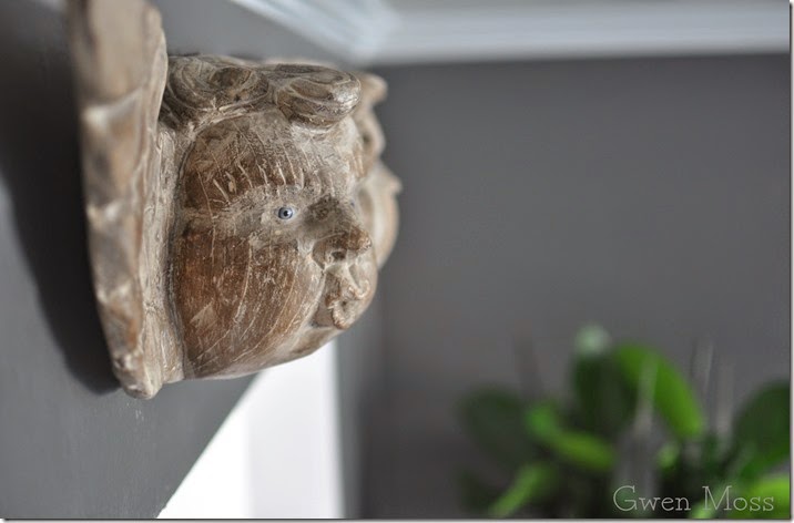
It looks fantastic!! What is the little wood face thing?
ReplyDeleteAh looks great Leslie...truly does.
ReplyDeleteBeautiful Fall display that looks great with all the room decor. Lovely gallery wall! Thanks for the idea of layering the cowhide on the seagrass rug. Patty/NS
ReplyDeleteI do love the gray on gray ~ bravo Leslie ~ it looks beautiful. xo
ReplyDeleteThey are perfection, Leslie. Just love the neutrals and yes, color can always be added with a gorgeous table setting, just like yours. Adore the flowers!
ReplyDeleteBeautiful, it turned out wonderful. I love it.
ReplyDeleteThank you for sharing.
Carla
The whole room looks beautiful, Leslie! Nothing is expected and the room is full of personality!
ReplyDeleteJust beautiful! I'm a color person too but this looks quite elegant on that gray wall that I LOVE! :) I think the tablescape & flowers are perfect. You should feel very proud of this accomplishment ~ and enjoy, enjoy!
ReplyDeletexo
Pat
Love the wall, my fav colors black and white! They look great on the gray wall and I have a bar cart in my diningroom too!
ReplyDeletecould not be better, well done leslie! killer room and the gallery wall is a topper. BTW, you are such a great photographer, what camera do you use?
ReplyDeletedebra
BRAVO, leslie! this looks so sophisticated and chic. lovin the contrast with the wall color.
ReplyDeleteI do love that black and white! It is so calming, and looks perfect against the dark wall. And you are so right about bringing in the color with your tablescapes. The wall would have competed for attention had you done the color there. Perfect and beautiful solution!
ReplyDeleteLeslie, it's gorgeous!! I think choosing the neutral prints was the right choice. It's so calm! Adding pops of colour in other places really shows how neutrals can work!
ReplyDeleteIt's beautiful! The whole room looks great. I do need a lesson or two in scaping a table - so I'll be waiting with bated breath.
ReplyDelete